Continuing with my review of RDi 9.6, I'll show you some features that continue to make RDi more like any of the other language editors you might be familiar with.
In my last article, I presented a lot of the visual enhancements of RDi 9.6, many of which centered on the use of the hover concept; hover over a component of your source code and you'll see information specific to that component. Alternately, the editor will provide decorations (small symbols) to indicate the availability of more information. Hover over one of those to see the particulars. This is a very high-profile enhancement that lots of people have been talking about because it is such a sea change. Today, though, we'll spend a little time on some additional features that might fly under the radar.
Help, I Need Somebody!
One of the fun things about writing articles like this is that I get to poke around where I otherwise might not, and in so doing I find little golden nuggets. Sometimes they're fool's gold, but even then, sometimes just the search is worth the effort. I had heard about a minor change in the user interface, and that led me to the top of the tool. By the top, I mean the menu bar just under the title bar of the window. This hasn't changed; you should be familiar with it from a release or two ago:
Figure 1: The primary menu bar for RDi 9.6 has the same options as previous versions.
It's a very standard menu bar, but I was doing a little side-by-side comparison when I noticed some things. Let me show you one in particular. Figure 2 shows the Help menus from version 9.5 and 9.6 (specifically, 9.6.0.1) side by side:
Figure 2: The Help changed from version 9.5 to version 9.6.
You can see that I've identified three changes. I'm not going to go through these changes exhaustively, but I recommend that you take some time to investigate as I've done. You'll find some interesting things! For example, starting at the bottom and working my way up, the first change is the performance submenu. It has a number of options, but one I found particularly intriguing was an option called Reduce Memory Now. Sounds exciting, doesn't it? Well, I ran it, and it did indeed reduce my memory usage by 6MB. Unfortunately, I only got it to work once and haven't been successful since. But it's certainly intriguing.
Speaking of intriguing, next is the Technology Quickstarts submenu. Unfortunately, that will have to remain shrouded in mystery since, at least on my machine, it doesn't actually do anything. Although it presents as a submenu, there are no options underneath it, so it may be a placeholder of things to come. Let's hope!
Finally, you'll see a couple of changes for the actual Help functions. What appears to be a new option, Show Contextual Help, is actually just a rename of the previous Dynamic Help option. The other addition, Index, is just a shortcut to an existing function, the Index part of the Contextual Help.
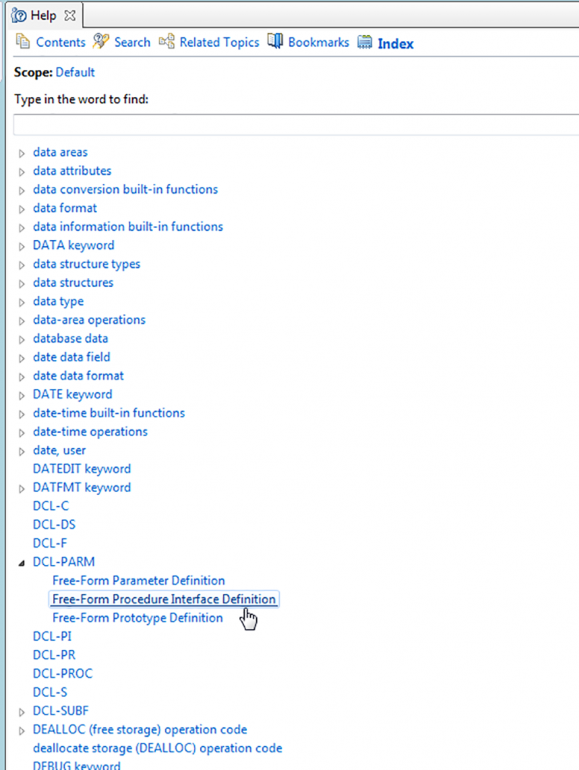
Figure 3: This is the Help index, a treasure trove of information.
The list in Figure 3 shows just how detailed the available information is. This, though, leads to one of the areas that I find a bit frustrating. It seems that, at least on my machine, most of the entries give me an error saying that the topic was not found:
Figure 4: This is the message I get for most of the Help index entries.
It's too bad; it seems like the Help index would be a great feature, but for now it's not terribly functional. And what makes this especially annoying is the fact that when the Help index works, you find some really cool stuff. For example, I found an entry that mentioned tutorials, and I got to this:
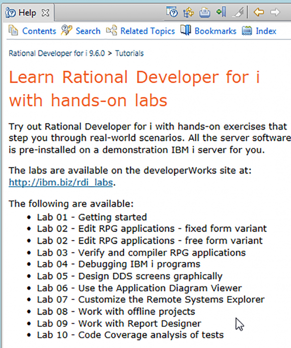
Figure 5: The Help index leads to a list of tutorials for RDi.
This is actually quite a comprehensive set of tutorials. Some of them are old friends that I've actually taught in days past, and some are newer entries with which I hope to familiarize myself in coming days. I'm particularly interested in the tutorial on Code Coverage. I mentioned in my last article that I wanted to learn about this new feature, and it's nice to have an IBM-supplied lab to help me get my feet wet. If only all of the help entries worked as well!
Something New, and Something New to Me
To close today's article, I'm going to show you something new and then a second something that's new to me that I found when researching the first topic. The new thing is really something very small, in more ways than one.
Figure 6: The perspective tools have been reduced in size from 9.5 (right) to 9.6 (left).
Remember how I said I got started with this whole article by looking into a specific change? This is the change. The right side of the toolbar in RDi has tool buttons that allow you to switch perspectives. I use only two, the Debug perspective and my own customized iEdit perspective, but depending on how you develop and which tools you are using, you can end up with many more perspectives. In previous versions of the tool, those perspectives were shown as they appear on the left side of Figure 6, with an icon and then the entire name of the perspective. As you can imagine, people with many perspectives lost a lot of real estate, which often caused the toolbar to have to wrap to two lines. A change in the underlying Eclipse codebase (something we'll talk more about another day) changes the default behavior of those icons so that they appear without text, as shown on the right side of Figure 6. You can still see the text if you need to. I'll bet you can even guess how: just hover over the icon! As it turns out, this change really wasn't that big of a deal; you can toggle the text on and off by right-clicking on the perspectives toolbar. The new behavior was just to default to not showing the text.
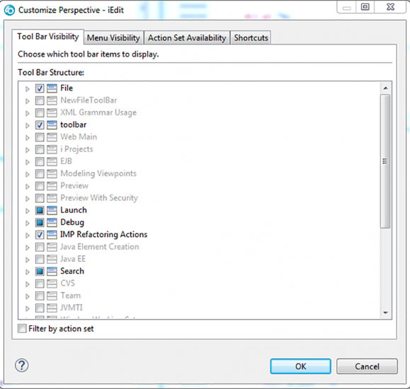
But when I was testing this, I ran across something that I think I'm going to spend some more time on. When I right-clicked on my iEdit perspective (which originally started as a copy of the standard Remote System Explorer perspective), there was an option for Customize, and I clicked on it. I got the following dialog:
Figure 7: The Customize Perspective dialog has a lot of capabilities.
While I don't pretend to know what all of these do yet, I think it's worth time to study a little closer. From what I can tell from initial investigation, it seems like this will allow me to add various features from other perspectives to my iEdit perspective. I don't know how useful this will be, but I'll look at it and let you know in an upcoming article. Until then, feel free to poke around and see what you can find!
(Last caveat: Before you change any perspective, I highly recommend you copy it to a test version and make your changes there. The last thing I want is for you to experiment a little and disable your workbench!)


 IT managers hoping to find new IBM i talent are discovering that the pool of experienced RPG programmers and operators or administrators with intimate knowledge of the operating system and the applications that run on it is small. This begs the question: How will you manage the platform that supports such a big part of your business? This guide offers strategies and software suggestions to help you plan IT staffing and resources and smooth the transition after your AS/400 talent retires. Read on to learn:
 Business users want new applications now. Market and regulatory pressures require faster application updates and delivery into production. Your IBM i developers may be approaching retirement, and you see no sure way to fill their positions with experienced developers. In addition, you may be caught between maintaining your existing applications and the uncertainty of moving to something new.
LATEST COMMENTS
MC Press Online