


Add more flavor to your charts.
In my last TechTip, I described how to set up Highcharts and how to make a very simple standard chart using Highcharts right out of the box. With a simple AJAX call, we created a line chart out of some very basic data. In this TechTip, we'll make the charts look better, add more functions, and dig into the API documentation to show how to find examples and test ideas.
Please note that in these tips I'm using a line chart. Highcharts can create all kinds of charts, but because of the limited space I have here, I'll just use line chart examples.
The Highcharts website has a huge demo section where you can test and play with the tool (see the links at the end of the tip).
How Is a Chart Built?
In Highcharts, you can say that a chart consists of four basic elements.
- The chart area—The main chart properties
- plotOptions—Defines the series style
- Series—The chart data
- xAxis and yAxis—Describes what data the chart is showing
The charts also have elements like titles, legend, exporting, navigation, and a whole lot of other stuff you can add to make the chart look and behave professionally.
I'm using the same chart example as used in the first TechTip and adding flavor to that chart. I'll provide code and picture examples as we go along.
The Chart Area
Let's start to add some changes to the chart area. In my example below, I have changed the following attributes on the chart area: backgroundColor, borderColor, borderWidth, and borderRadius.
Here's the code:
$('#chart_area').highcharts({
chart: {
type: 'line',
backgroundColor: '#D4FFFF',
borderColor: '#000000',
borderWidth: 2,
borderRadius: 3
},
Note that the syntax is very straightforward "jQuery-ish," so it's pretty easy to get things in place.
The chart now looks like Figure 1.
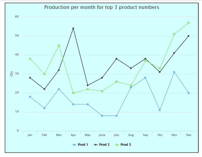
Figure 1: Add background colors and borders to the chart.
Note that the lines in the chart can be a little hard to see because they "blend in" with the new background color, so let's add some colors to the plot area of the chart.
The code will now look like this:
$('#chart_area').highcharts({
chart: {
type: 'area',
backgroundColor: '#D4FFFF',
borderColor: '#000000',
borderWidth: 2,
borderRadius: 3,
plotBackgroundColor: '#FCFFC5',
plotBorderColor: '#000000',
plotBorderWidth: 0.5
},
The chart now looks like Figure 2.
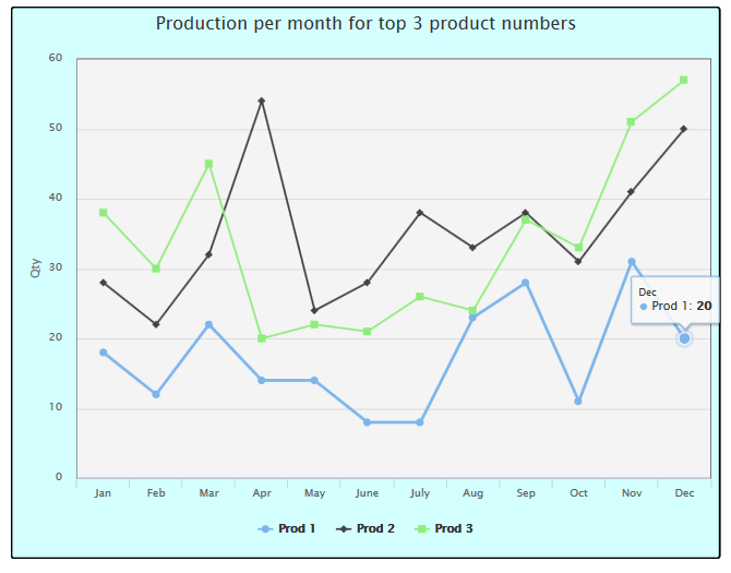
Figure 2: Add background colors and borders to the plot area.
As you can see very little code has to be added to get a completely different look of the chart.
To get an idea of what you can do with the chart area, have a look at the Highcharts API here.
Changing the Plot Options
The plotOptions is the place where you define how the data series will look and behave, depending on the chart type you are using.
In our example, we want to do the following:
- Add data labels to the chart
- Disable mouse tracking
To do just that, we will use the "dataLabels" and the "enableMouseTracking" options, and the code will now look like this:
plotOptions: {
line: {
dataLabels: {
enabled: true
},
enableMouseTracking: false
}
},
This will make the chart look like the one in Figure 3.
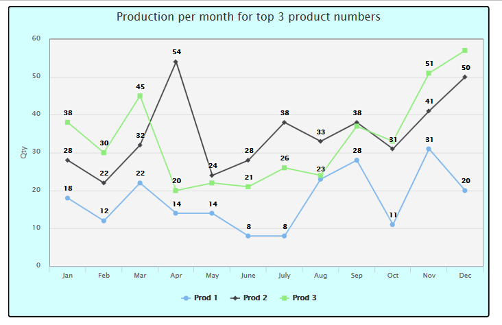
Figure 3: Add data labels and disable the mousetracking.
To see what you can do with the plotOptions have a look here.
Let's Get Serie-us
Now it's time to make some changes to the lines in the chart. I think that we should do the following:
- Change the colors of the lines
- Change the line width for the lines
- Enable mouse tracking for Prod 1
- Enable point select for Prod 1
So now, the code for the series looks like this:
series: [
{
name: 'Prod 1',
data: line1,
color: 'red',
lineWidth: 1,
enableMouseTracking: true,
allowPointSelect: true
},
{
name: 'Prod 2',
data: line2,
color: 'blue',
lineWidth: 2,
},
{
name: 'Prod 3',
data: line3,
color: 'green',
lineWidth: 4,
}
]
And the chart now looks like Figure 4.
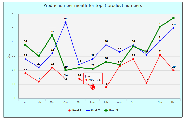
Figure 4: Change lines, line colors, and mousetracking.
Of course, you can do many more things to the series part, so have a look at the API here.
xAxis and yAxis
The last changes we'll make to the "basic" chart part are related to the x- and yAxis and the grid. Let's change the following:
- Make the grid dotted, thin, and light orange
- Rotate the month on the xAxis
When done, the code will look like this:
xAxis: {
categories: dateString,
gridLineWidth: 0.8,
gridLineDashStyle: 'dot',
gridLineColor: '#FFAA00',
labels: {
rotation: -40
}
},
yAxis: {
title: {
text: 'Qty',
},
gridLineWidth: 0.8,
gridLineDashStyle: 'dot',
gridLineColor: '#FFAA00'
},
Now, the chart looks like Figure 5.
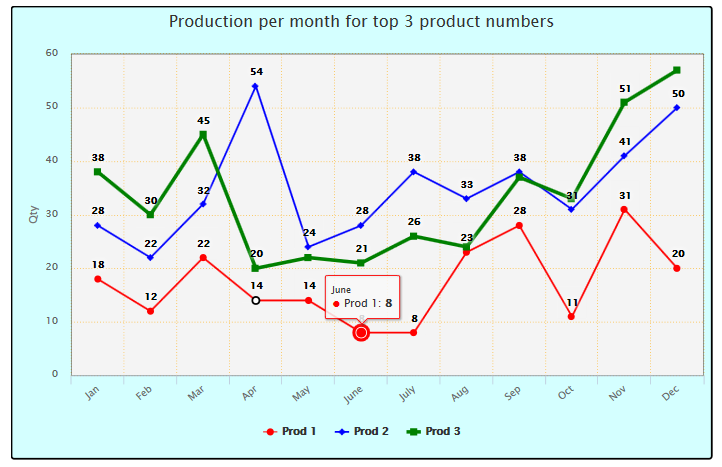
Figure 5: Change the grid and rotate the xAxis data.
Some Words About the Highcharts API Documentation
I have already provided links to the API Reference, and I must admit that I find the documentation with accompanying examples so good that I really consider it an important part of the tool. When you read the API Reference, you just open up the various parts, and for every option there's a description and a link to jsFiddle, where the code is shown. In jsFiddle, you can change the code and then press Run to see the result right away—very easy and very good when you're trying out ideas.
So to give an example, let's say you want to add a border around the legend. Do the following:
- Go to .
- Click the "legend" section.
- Click the "borderWidth" to see a description and a link that shows how it works.
This means that to add a dark red border around the legend, the code will look like this:
legend: {
borderColor: '#990000',
borderWidth: 1,
},
Note that because the borderWidth defaults to zero, you must also enable this and set it to something greater than 0.
End of Part 2
You have now reached the end of part 2, and I really hope you're beginning to see what Highcharts can do for you.
Until next time, put some flavor in the charts and impress everybody.
Download the code from here.
See the example in real life here.

 Business users want new applications now. Market and regulatory pressures require faster application updates and delivery into production. Your IBM i developers may be approaching retirement, and you see no sure way to fill their positions with experienced developers. In addition, you may be caught between maintaining your existing applications and the uncertainty of moving to something new.
 IT managers hoping to find new IBM i talent are discovering that the pool of experienced RPG programmers and operators or administrators with intimate knowledge of the operating system and the applications that run on it is small. This begs the question: How will you manage the platform that supports such a big part of your business? This guide offers strategies and software suggestions to help you plan IT staffing and resources and smooth the transition after your AS/400 talent retires. Read on to learn:
LATEST COMMENTS
MC Press Online